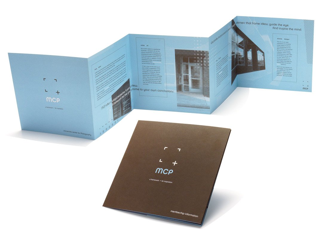
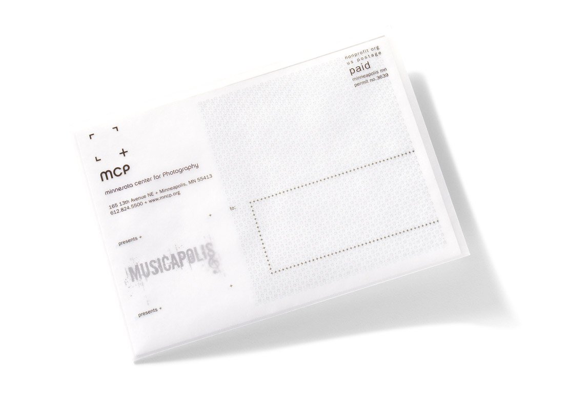
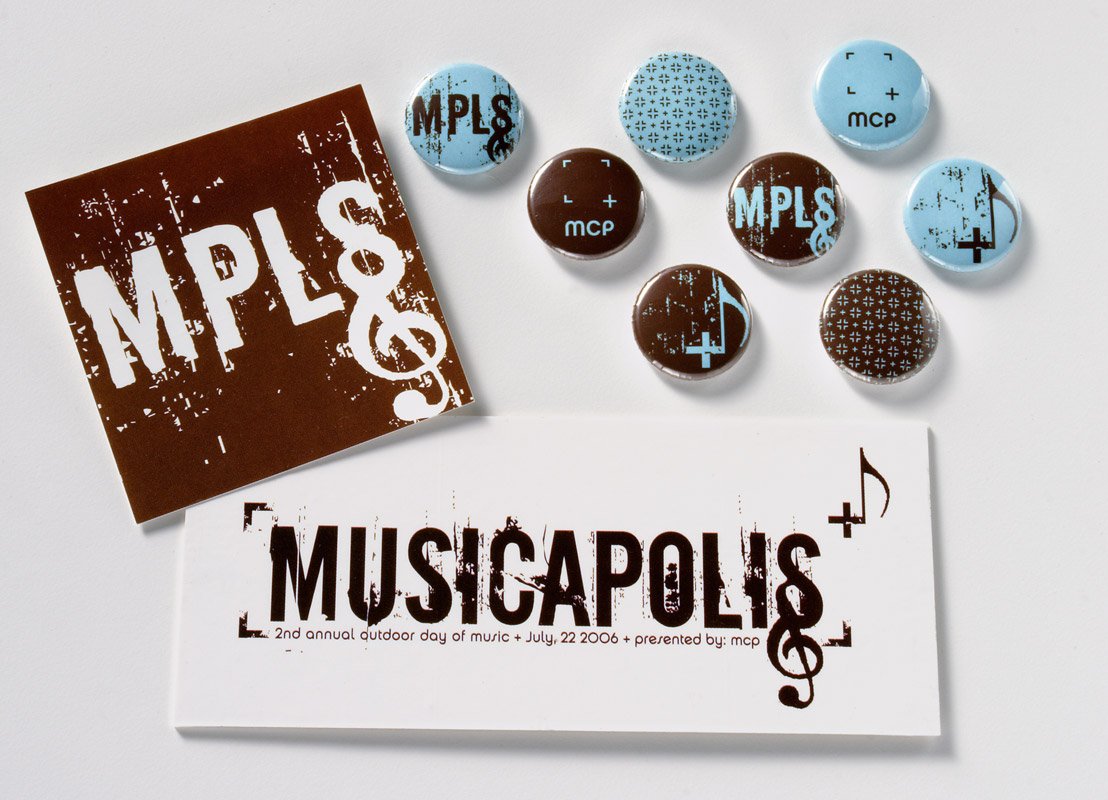
Minnesota Center for Photography: identity and brand
A new photography gallery, managed and run by photographers, was opening in northeast Minneapolis. It would function as both a gallery to showcase local and global talent and as an education center for all things photography. Their mission was to always have patrons leave with more than they arrived with. That was inspiration to use the plus symbol as a corner of the camera’s viewfinder. The viewfinder represents the photography medium and the plus symbol is the inspiration/knowledge that people gained by attending MCP.
creative director: Cheryl Watson designers: Daniel Anderson, Lindsey Gice, Chad Olson